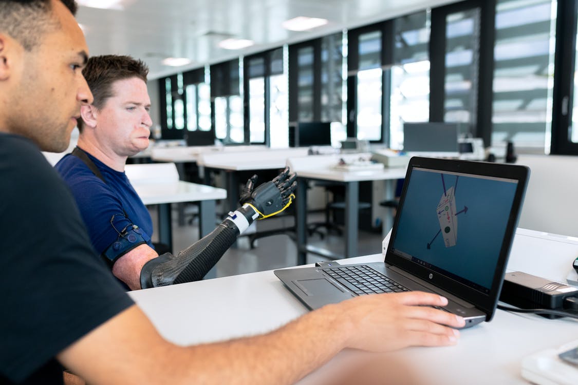
Designing a website for users with disabilities improves the digital experience for a wider audience. Accessibility Experience (AX) can help ensure that digital resources are usable by everyone equally, leading to better learning experiences.
Accessibility Experience (AX)
The fact that every good user experience should be an accessible experience ought to be embraced as a challenge. A challenge in which accessibility is not an afterthought with the QA team testing for errors. That's an inefficient model of implementation.
Accessibility has to be embedded as a process within the designers and developers. It is the best way to learn and a progressive approach to design and build websites. It makes sure that responsibilities are diverse as good ownership throughout the organization at every level.
A design based on the principles of AX advocates for involving users in design decisions. This is by far the most important part of designing. It's a powerful approach to making your product more usable.
It's established that research is the best way to start, designing for higher education website mainly has three different kinds of personas.
- Students
- Educators and enablers
- Parents of the students

Keeping these three personas in mind here are 5 ways for conducting viable research for a good higher education accessibility experience.
- Research with the team — It's usually the designers or user researchers seen on the desk and the field during research but with a topic as sensitive as accessibility developers, managers, and QA team should be part of it for a shared understanding and a much more viable approach towards the final output.
- Respect the users — Understand the pain points and limitations faced by disabled people every day in their life. A student or a parent of the student may not be comfortable while speaking about their problems. Desk research and an understanding of their problems beforehand can help to not add on to their pain when you speak with them directly.
- Ask fewer questions and be more observant — Understand that your users are going through many fragmented experiences. Instead of creating a long list of questions that may cause them trouble, consider walking in an NGO or the campus to observe their day-to-day tasks while accessing the computer.
- Try the solutions on yourself — How does a blind person navigate only through the keyboard, how does a person with dyslexia view the message on their screen or how does a person with seizure triggers deal with flashing pictures or motion art? Try the tools available online to experience the limitations yourself to fully empathize with your users.
- Tech should be compassionate and not smart always — People use varied technologies and it's impossible for everyone to be backed up by the latest technology. It's a compassionate approach to tech when you consider the needs of the users with different operating systems.
Creating an accessible experience is not hard.
It requires a process in place with a team willing to work on it from the very beginning of the project. The higher education websites as a platform for change have the potential to impact lives across the globe, with that potential also comes a greater responsibility. What is expected of a good higher education website is to continuously progress, efforts to improve and strive to be inclusive in their approach.
Research is how design begins as a process.
It's a step that helps to guide the entire process of design and development. If the research is done right the findings can help to think analytically, make effective observations, ideate rationally, and test and implement feasible and creative approaches. It could be a lot of work and consume time but in the end, all that hard work shows through the accessible digital experience that truly resonates with every user there is.

